My last post, Creating a Homepage That Feels Like Home, explored how to create a homepage with intention, clarity, and authentic expression. Making your visitors feel welcomed and seen. But intention alone isn’t enough; you need words to bring your vision to life.
Remember, your homepage is where first impressions are made — and sometimes, lost. Done well, it gently invites your people in. If not, a visitor may quietly slip away and never return.
Thanks for reading Pixel Wise! Subscribe for free to receive new posts and support my work.
So it’s really important that you get this right!
This guide builds on the ideas shared in my previous post and helps you turn them into actionable steps. It’s designed to help you craft compelling, effective homepage copy that speaks to the heart of your ideal client.
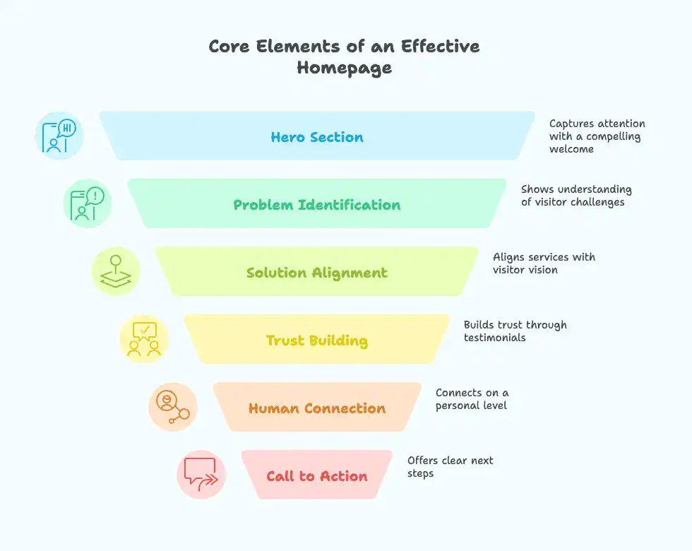
Let’s start with an overview of the essential components:
Core Elements of an Effective Homepage
Think of these as stepping stones, helping your visitor quickly self-select as to whether they’re in the right place.
- Hero Section: Reflects the essence of your core message.
- The Problem: Shows you understand their challenges.
- The Solution: Aligns your services with their vision.
- Testimonials: Builds trust through real stories.
- About You: Connects human-to-human.
- Call to Action: Offers clear next steps.
- Visual Harmony: Ensures your message and design makes for a cohesive experience.
When done right, these elements work together to speak directly to your ideal client — making them feel seen, understood, and guided. A homepage isn’t about selling or converting but creating an authentic space where the right people feel truly at home with what you offer.
Here’s a deep dive into bringing them to life.
1. Hero Section: Your First Hello
Your hero statement captures the essence of who you are and what you offer. It’s in the top section of your homepage and it quickly tells your visitor:
- What you do.
- Who you do it for.
- Why it matters to them.
Example Headline:
We are a team of chiropractors who help weekend warriors get back in the game by eliminating back problems and injuries.
Example Subheading:
We utilize the latest technology to minimize uncomfortable pushing and pulling during adjustments.
Action Tip: Think of your hero statement as your homepage’s thesis — it sets the direction for everything that follows. Take the time to craft it thoughtfully because this is where your visitors decide to hang around or make an exit.
2. The Problem: Lead With Empathy
Your audience arrives with questions and unspoken challenges. Use this section to:
- Acknowledge their struggles.
- Offer understanding and hope.
- Set the stage for how you can support them.
Example:
You’re frustrated by ongoing back pain that keeps you from doing the things you love. Whether it’s missing out on pick-up soccer games or struggling to hike that favorite trail, you’re searching for relief that lasts.
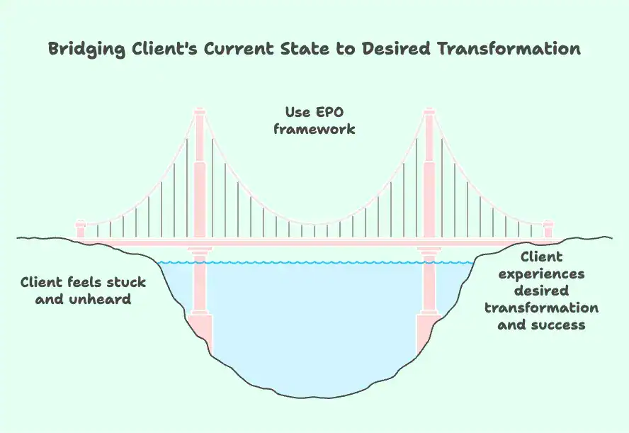
3. The Solution: Imagine What’s Possible
This is where you get to make everything better. Help your audience envision a better future and show them how they can move from where they are to where they want to be.
Focus on what they’ll gain, not the process.
And I suggest moving beyond the traditional “Pain-Agitate-Solution” approach.
Instead, embrace the EPO framework:
- Empathy: Start by genuinely connecting with your client’s emotions and experiences.
- Possibility: Paint a vivid picture of the outcome they’re longing for. Show them it’s not just a dream, but an achievable reality.
- Opportunity: Position your service as the bridge that will take them from their current situation to their desired outcome.
Example:
Imagine being able to play your favorite sport again, free from nagging back pain. Using gentle, precise adjustments and state-of-the-art technology, we help weekend warriors like you get back to the activities that bring them joy.
4. Testimonials: Let Your Clients Sing Your Praise
Real-life, raw, honest testimonials. Preferably with full name and a picture.
- Share specific outcomes.
- Highlight the emotional as well as the practical benefits.
Example:
Dr. Sarah and the team got me back on the basketball court faster than I thought possible. The adjustments were so much easier than I expected, and now I feel stronger and pain-free! — Mike Jones., Patient and Weekend Hoops Player
5. About You: Where Relevance Meets Authenticity
The about section is actually about the person who’s reading. It is a place for you to talk about yourself but only in the context of how you help the reader (your clients).
I know it sounds counterintuitive, but people first want to know how you can help them; only then do they care about learning more about you.
Example:
We’re Dr. Sarah and Dr. David, chiropractors who specialize in helping active individuals overcome back pain and prevent future injuries. Our gentle approach, backed by the latest chiropractic technology, is designed to keep you moving and doing what you love — without unnecessary discomfort.
6. Call to Action: Taking the Next Step
Every homepage should end with a warm, actionable invitation. This is the moment where all the sections of your page guide visitors to take meaningful action.
Best Practice: Display your primary call to action (e.g., “Schedule an Appointment”) prominently in the upper-right corner of your site’s header and again at the bottom of your homepage. For visitors who may not be ready to commit, include a “softer” secondary option like “Subscribe to My Newsletter” or “Learn More.”
Example:
Ready to reclaim your weekends? Let’s work together to eliminate pain and help you get back to your favorite activities. Schedule your first consultation today!
7. Visual Harmony: A Holistic Experience
Your design choices should amplify your message while creating an intuitive and welcoming experience.
- Use colors and visuals that evoke trust and warmth.
- Avoid clutter —l et whitespace and clean layouts guide the visitor.
Action Prompt:
Look at your current homepage. Does the design reflect the essence of your message? If not, consider tweaking colors, imagery, or copy for consistency.
In Closing
Your homepage isn’t just an online brochure; it’s the visual language of your brand’s soul. When your copy is fueled by empathy and clarity, the journey you offer becomes an act of service, making it easy for your visitors to quickly decide if you’re for them. Which by default brings more of the right people into your world.
Before you can craft compelling homepage copy, though, you’ll need to clarify your message, define your audience, and give shape to your purpose. Creating a Homepage That Feels Like Home guides you in this process. And for you visual learners, explore my Visual Page Guide, for practical layout and visual inspiration.
Here’s to creating online spaces that truly feel like home.